Physical histograms of mail
March 28, 2013
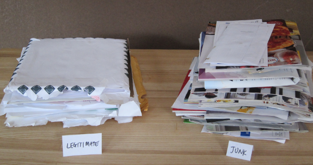
Photo by Dean Malmgren
Four short months ago, before the recent frenzy over rural post office closings and 5-day delivery, we had a lunch conversation about the utility of the U.S. Postal Service. The Postal Service has an important role in American history, but I’ve been frustrated by the huge fraction of mail that is unsolicited catalogues and brochures (could this be the reason?). At lunch, I think I was even bold enough to claim that “close to 99% of the mail we received was junk.”
To test just how far-fetched that claim was, and intrigued by doing a non-digital project, I’ve been hoarding all incoming mail to Datascope, including bills, payments, brochures, letters, holiday cards, take-out menus and catalogues. Every day, I’ve split the mail into two piles, creating a histogram that physically sits on a table. The first pile consists of “legitimate mail” that was requested by Datascope in one form or another, such as invoices, checks, and other mail personally sent to Datascope. The second pile consists of “junk mail” that was not specifically requested by Datascope, such as brochures, catalogs, Comcast pamphlets, etc.
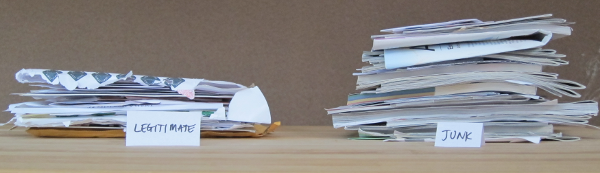
I concede that 99% was an aggressive estimate, but was still surprised to see that junk mail literally outweighs legitimate mail 2:1. This is admittedly a small sample (n=1 address), but seriously, I’m amazed at how much mail is unsolicited crap.
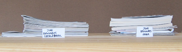
What is even more surprising is the fraction of junk mail that is just a glossy brochure or catalogue versus delivered in an envelope.
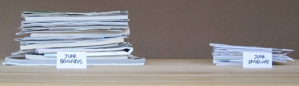
For those with a sense of humor, most of the “junk envelope” deliveries are from Comcast soliciting their high-speed internet service. This is pretty stupid because of they know we can’t even be customers: we requested Comcast service when we moved in and they wouldn’t wire our building. Seriously Comcast, can’t you save some paper and postage by doing a better job at targeting customers that have a non-zero probability of buying your shit?
More staggering still is the fact that, after buying some furniture from them, Crate & Barrel/CB2 has sent us a glossy page for every glossy page that all other senders send, combined. In fact, since Crate & Barrel sends us two copies of everything, they have sent us just as many pages of unsolicited crap as our entire business has received legitimately over the last few months [not pictured]. Wow.
In addition to being simple, this side-project was an enjoyable way to visualize data. We often set up complex databases and analysis for digitally recording physical things, but in this case all it took was a photo and, voilà, a histogram of the objects which we want to analyze. We’ve seen other examples of physical histograms, such as M&M colors in a bag, music collection aggregated by artist initial, and exam grades. Do you have any other examples of physical histograms?