Thomson Reuters: visualizing the collaborative nature of academic reports
December 11, 2012
Following the “elaboration phase” workshop where we reimagined the presentation of several analyses in Thomson Reuters’ InCites product, we started working on the first “quick wins” project: redesigning the Collaborating Institutions and Collaborating Authors reports in InCites. These reports were created to address two primary use cases: (i) university administrators that want to quantify the extent to which their institution and faculty are collaborating and (ii) funding agencies that want to target well-connected institutions and authors.
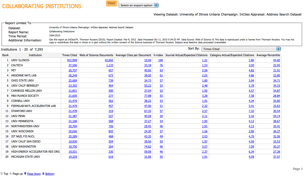
As a first stab at quantifying this information, Thomson Reuters developed the initial collaboration reports by producing tables of data related institution and author collaborations. The two major challenges with presenting this information in a table is that (i) it is very hard to convey a sense of collaboration in a tabular format and (ii) since collaborations are between two authors/institutions, presenting collaboration information for N entities would require a maximum of N2 rows in a table. Here is a screenshot of the original report illustrating these challenges.
Keeping the initial use cases in mind, we started our redesign process by developing several sketches that started to work out the details of how we could visualize the collaborations between different entities in a useful way. Our first design principle was to evoke something that looked like institutions and authors working together. Rather than displaying the data in its raw tabular form, we switched to visualizing these collaborations as a network whose nodes represented institutions or authors and whose links quantified the extent of their collaboration.
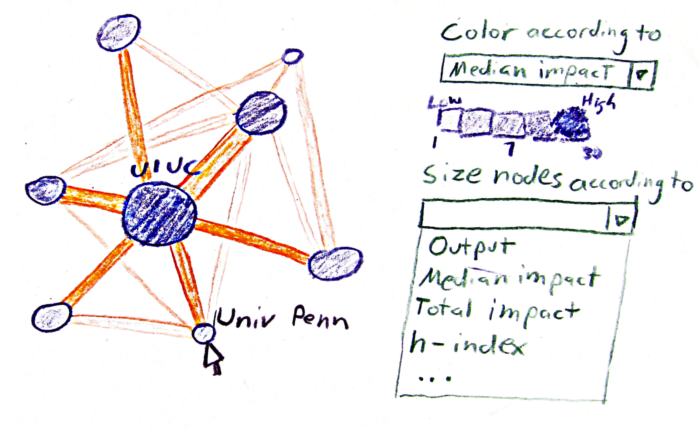
Considering that university administrators are primarily interested in who their main collaborators are and that funding institutions want to evaluate the collaborative capability of individual institutions or authors, we made the design decision to limit the visible network to an ego network around a single focal node. It further reduces the complexity of visualizing a massive network of collaborations that, although intriguing, are overly cluttered for making quick decisions.
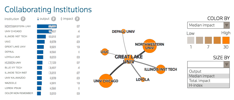
Combining the network view with a searchable table makes it possible to quickly identify various focal institutions and authors that can be examined along several different bibliometric dimensions. We are particularly proud of this interface as it demonstrates the utility of designing infographics starting with the use cases of real people and iteratively improving the concept.
Contributors to “Thomson Reuters: visualizing the collaborative nature of academic reports”


Wondering why there are multiple contributors? At DsA, we work in teams. Even on blog posts, we often work together or ask for others to take a look at the post before we post it. When we do that, the pictures of those that wrote the post are larger than those that edited the post.